Heat case study
Heat case study
Introduction - Heat Media pack:
1) Look at the Heat Media Pack. Go to page 2: the Heat mission. Write three things that Heat offers its readers under 'print'.
In print – we bring readers a truly unique, quality experience. From clever A-list access shoots no other magazine could pull off to celeb news – heat has the celeb contacts to give readers the exclusive every time.
2) Now go to page 3 of the Media Pack - celebrity focus. What does the page say that Heat offers readers?
We ensure heat readers are always in the know and give them conversation- starters they can show off about to their mates down the pub. Our journalists have the answers to the questions before they’ve even been asked. We help celebrities to talk about their biggest secrets and we find the funny, wherever it’s hiding.
3) Now look at page 4 of the Heat Media Pack. What other content does Heat magazine offer its readers aside from celebrity news?
Life Hacks
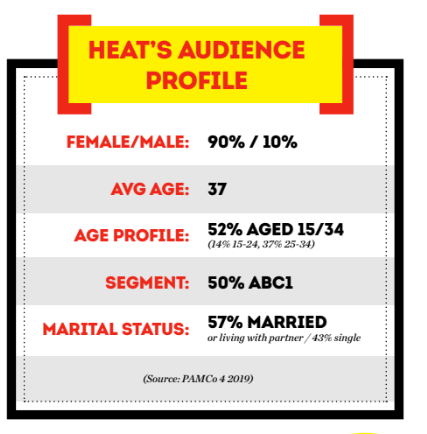
4) Look at page 5. What is Heat magazine's audience profile? Write all the key details of their audience here.
Media language:
1) How are the cover lines written to make the audience want to buy the magazine?
Using bold and catchy language that grabs the reader's attention and piques their curiosity.
2) What are the connotations of the Heat colour scheme on this particular front cover?
Vibrant tones of pink, purple, and red make up the colour palette of the front cover of Heat magazine, which exudes aggressiveness, excitement, and vitality. Given that these hues are frequently connected to love, romance, and glamour, it stands to reason that the magazine's content will likely be mostly focused on lifestyle, relationships, and celebrity rumours. Bright colours can also give an image that is energetic and attention-grabbing, suggesting that the magazine has engaging and attention-grabbing content. The Heat magazine front cover's colour choice, taken as a whole, exudes excitement, enjoyment, and indulgence.
3) How are images used to create interest in the magazine? Find three reasons for your answer. (E.g. paparazzi images or aspects of mise-en-scene such props, costume, make-up, body position, facial expression etc.)
1) Paparazzi images - The use of paparazzi images in magazines creates interest by giving readers a glimpse into the lives of celebrities. The candid nature of these images can create a sense of authenticity and provide a behind-the-scenes look at the glamorous world of Hollywood.
2) Mise-en-scene - Images in magazines often feature carefully curated mise-en-scene, including props, costumes, makeup, body position, and facial expressions, to create interest. These elements can help convey a specific mood or theme, making the images more visually compelling and engaging for readers.
3) Fashion and beauty photography - Many magazines feature stunning fashion and beauty photography, showcasing the latest trends and designs. These images create interest by inspiring readers with new looks and styles, as well as offering a form of escapism into the world of high fashion and glamour.
4) What differences can you find between the use of design and typography between Tatler and Heat? List at least three differences and explain the effect on audiences.
1) Visual style: Tatler typically uses a more elegant and sophisticated visual style in its design and typography, with refined and classic typefaces and layouts. This conveys a sense of luxury and exclusivity to its audience, which is often made up of affluent and high-society individuals. In contrast, Heat tends to have a more playful and bold visual style, with a mix of fun and quirky typefaces and layouts. This reflects the magazine's focus on celebrity gossip and entertainment, appealing to a younger and more mainstream audience.
2) Hierarchy and organization: Tatler often employs a more structured and hierarchical approach to typography and design, with clear and formal organization of content. This aligns with its audience's expectation for a polished and sophisticated reading experience. On the other hand, Heat tends to have a more chaotic and dynamic layout, with a focus on eye-catching visuals and attention-grabbing headlines. This reflects the magazine's aim to capture the reader's attention quickly and maintain their interest through a lively and engaging format.
3) Use of color: Tatler tends to utilize a more restrained and refined color palette in its design and typography, often incorporating muted and understated tones to convey a sense of elegance and sophistication. This appeals to its audience's appreciation for classic and timeless aesthetics. In contrast, Heat embraces a vibrant and bold use of color, often incorporating bright and energetic hues to create a visually dynamic and attention-grabbing experience. This resonates with its audience's preference for a lively and upbeat visual style that reflects the magazine's focus on popular culture and entertainment.
Media Representations:
3) How are women represented on the cover of Heat? Think about both images and cover lines here.
Cover lines usually focus on topics like feuds, breakups, celebrity dramas, or make-ups, which can result in a sensationalised image of women. Furthermore, using provocative or attention-grabbing language in the cover lines may lead to an emphasis on women's beauty and personal lives rather than their accomplishments or contributions.
Comments
Post a Comment